Overview Analysis
BlendVision provides visualized charts for performance and audience trend analysis.
This article details how to use the charts and utilize filters to analyze content performance:
Before we start
- Refer to the Analysis Module Introduction to learn how to access the Analysis module on the BlendVision One web console and its key features.
- For detailed data and reports for each type of content, please refer to the articles below:
- Individual VOD Analysis for VODs
- Individual AOD Analysis for AODs
- Individual Livestream Analysis for livestreams
- Download Analysis Reports for steps on downloading a csv report
Overview analysis with filters
In the "Overview" tab, you can access and track aggregated data for your content by using visualized graphics, providing you with an overview of your content’s performance.
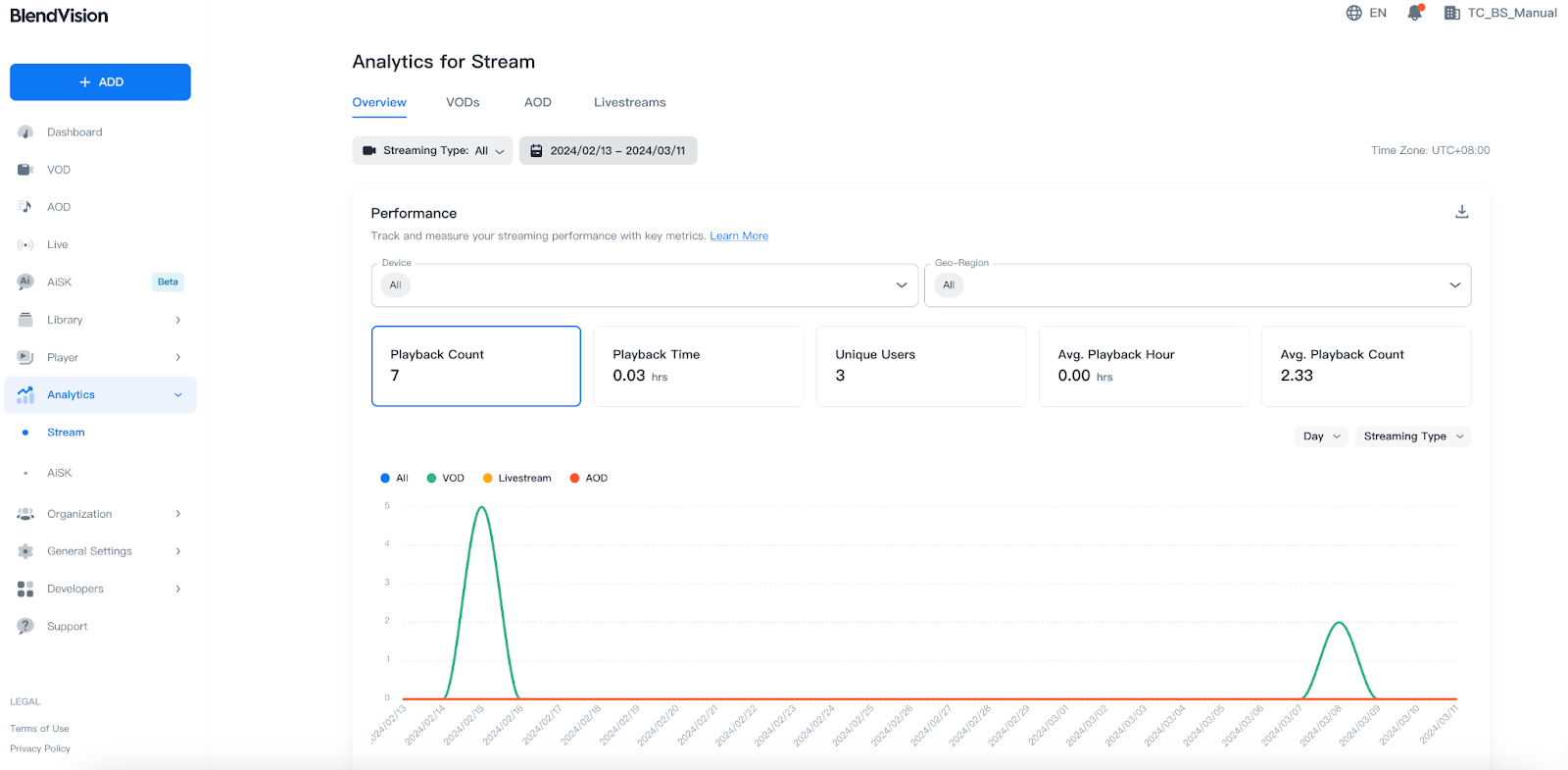
Streaming Type and Time Range filters
On the top of overview tab, you can set up filters to narrow the data displayed on the visualized graphics:
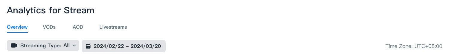
- Streaming Type: select and filter content type by All, Livestream, and VOD.
- Time Range: select and filter the time range
- Last N days: select from 7, 28, 90, and 365 days.
- Custom: set a custom start and end date.
Note: All data is displayed in UTC
Performance
In the Performance section, you can assess your content’s performance metrics using the provided line and pie charts.
- Devices and Geo-Region filters
- Time series chart
- Pie charts
Devices and Geo-Region filters
Filters can control the data display on both the line and pie charts.

- Devices: select and filter by the type of device used by your viewers.
- Geo-Region: select and filter by the country where your viewers are located.
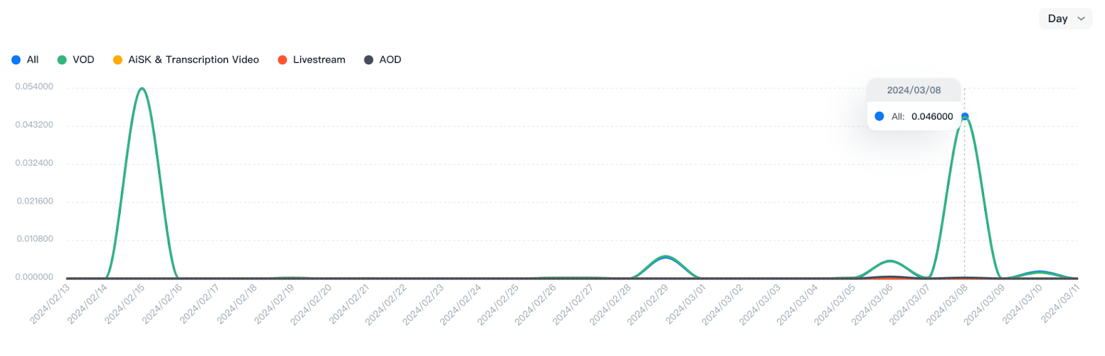
Time series chart
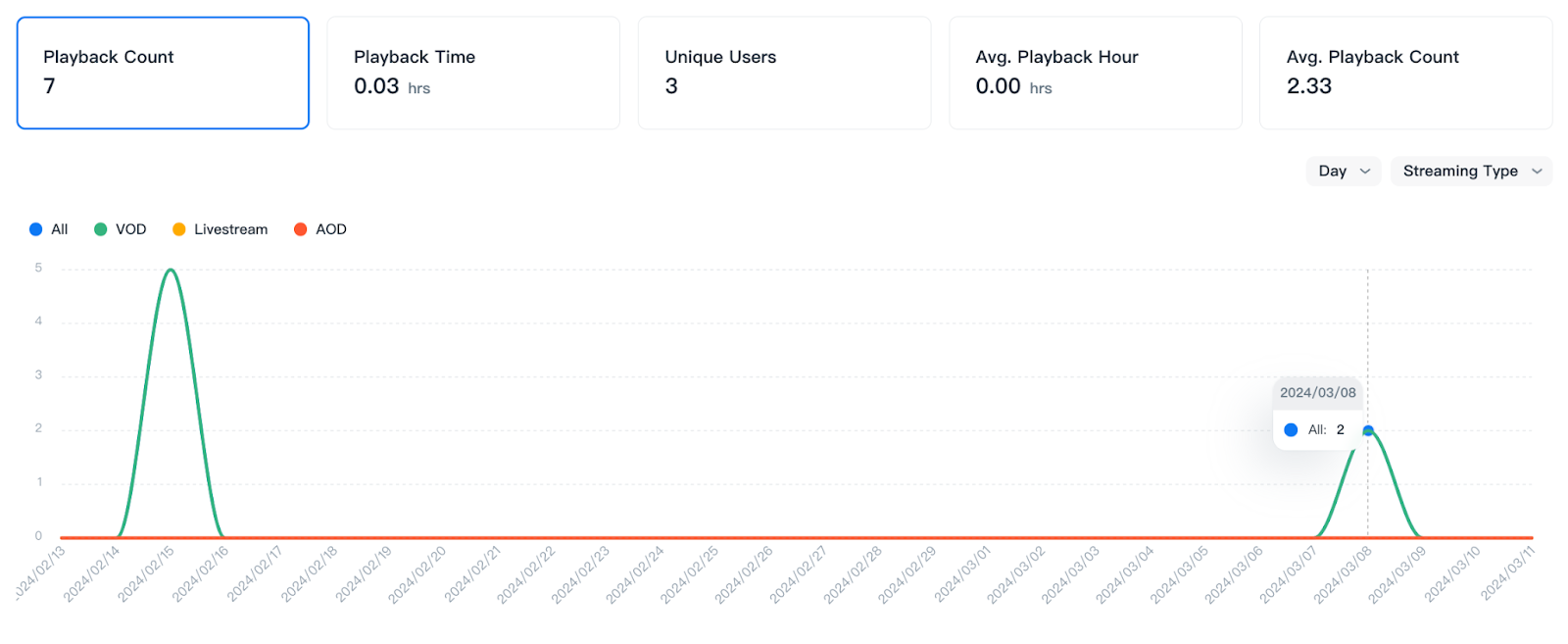
Metrics
You can confirm the following metrics within the selected time range, and switch the displayed chart by pressing each metric option:
Metrics
Definition
Playback Count
The amount of playback of your content.
Playback Time
The estimated amount of time that users watched your content.
Note: Due to network latency when sending logs, there may be up to 13 seconds of latency for this metric.
Unique Users
The estimated number of unique users estimated by counting unique device IDs.
Avg. Playback Hour
The estimated average hours watched per playback (total playback time / total counts of playback).
Avg. Playback Count
The estimated average count per users (total playback counts / unique users).
Chart display
You can quickly switch the chart’s time interval and type by pressing the drop-down menu on the upper right side of the line chart.
![]()
- Select the left drop-down menu to switch between time intervals: Hour, Day, Month, Quarter, and Year.
- Click on the right drop-down menu to switch between chart types: Streaming Type, Device, and Geo-Region.
Line chart
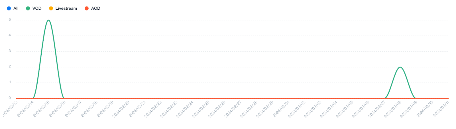
You can confirm details on the line chart by:
- Hovering over data points to get detailed information.
- Hovering over the legend to highlight the corresponding line.
- Click on the legend to the display/hide the corresponding line.
Pie charts
You can check different types of pie charts for your performance metrics.
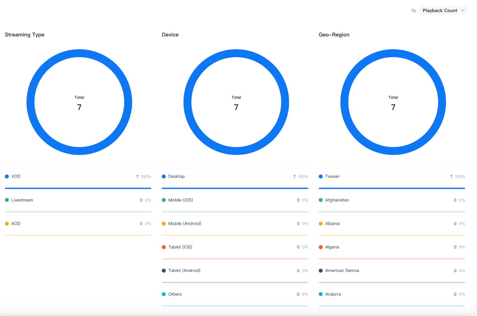
Pie chart
Definition
Streaming Type
The type of content
Device
The type of devices used to watch your content
Geo-Region
The countries where your content was viewed.
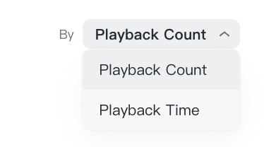
Metrics
Press the dropdown menu on the upper right side of the pie chart to switch the display between Playback Count and Playback Time:
Proportion chart
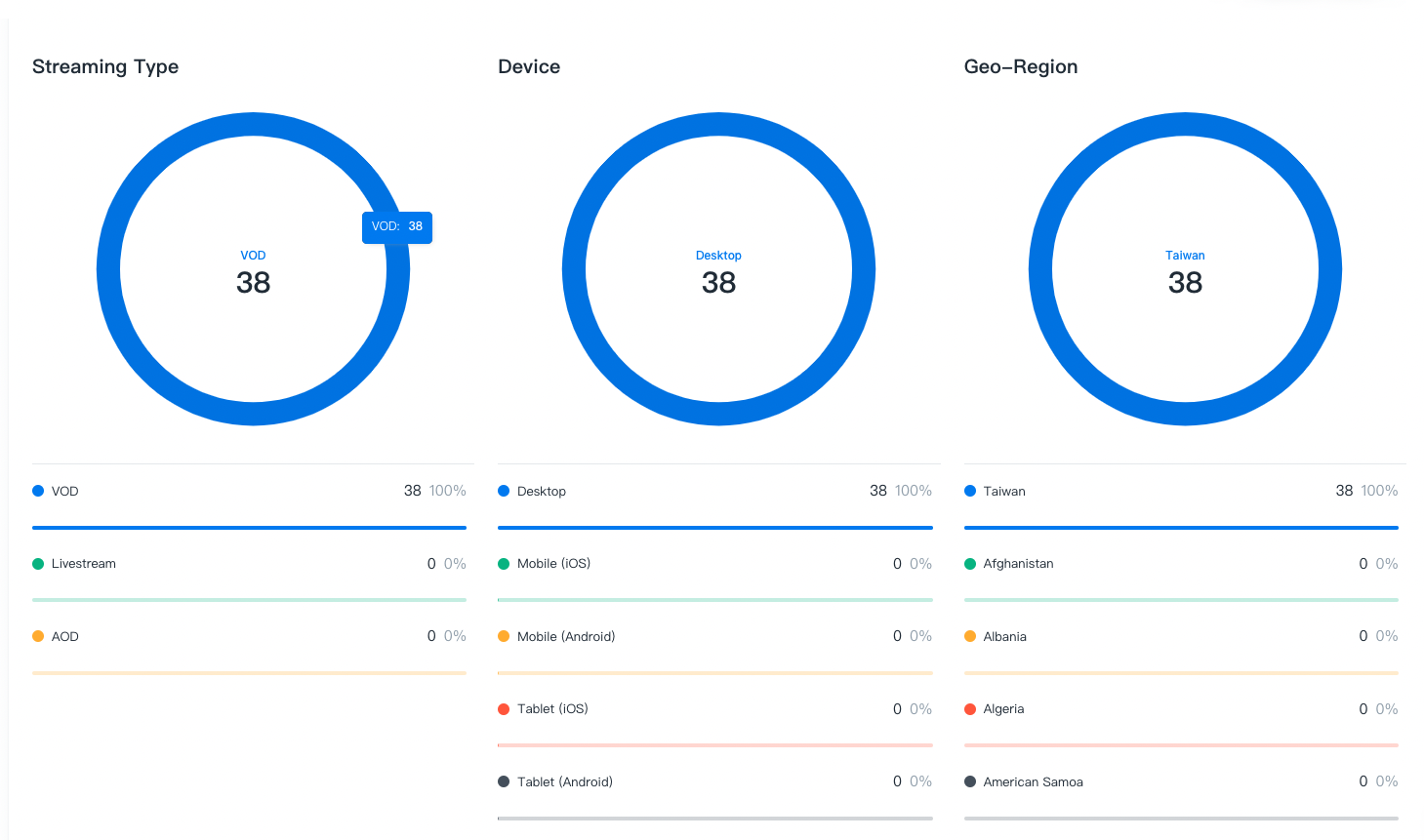
You can confirm details on the pie charts by:
- Hovering over the data to get detailed information.
- Clicking on the data to pin/unpin the metric and values.
Usage
In the Usage section, you can assess your content’s performance metrics using the provided line charts.
Note: Displayed records are for reference purposes only. For actual billed data, please check the Dashboard or in Organization > Billing.
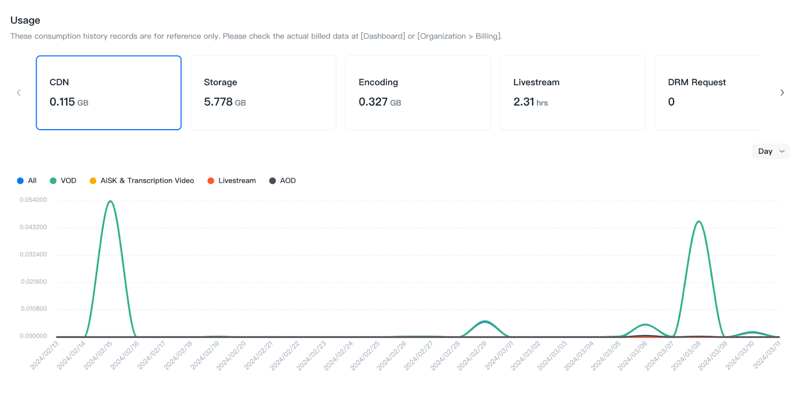
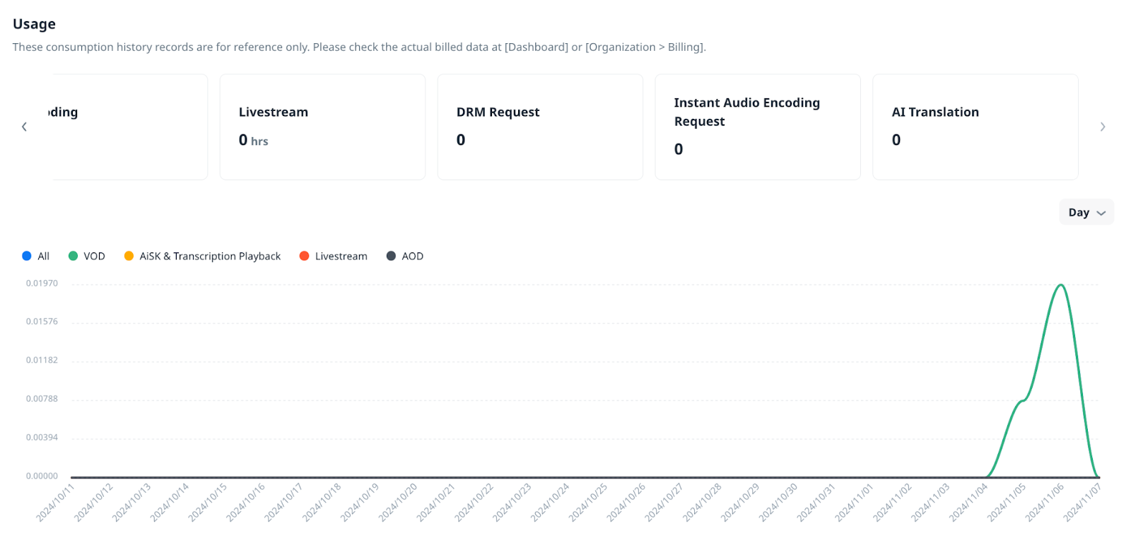
Metrics
You can confirm the following metrics within the selected time range, and switch the displayed chart by pressing each metric option:
Metric
Definition
CDN
CDN usage by GB.
Storage
Storage consumption by GB.
Encoding
Encoding usage by GB.
Livestream
Livestream duration by hours.
DRM Request
DRM requests by amount
Instant Audio Encoding Request
Audio encoding requests by amount
AI Translation
Subtitle characters of AI translation by amount
Chart display
![]()
You can quickly switch the chart’s time interval by pressing the drop-down menu on the upper right side of the line chart to switch between: Hour, Day, Month, Quarter, and Year.
Line chart
You can confirm details on the line chart by:
- Hovering over data points to get detailed information.
- Hovering over the legend to highlight the corresponding line.
- Click on the legend to the display/hide the corresponding line.